


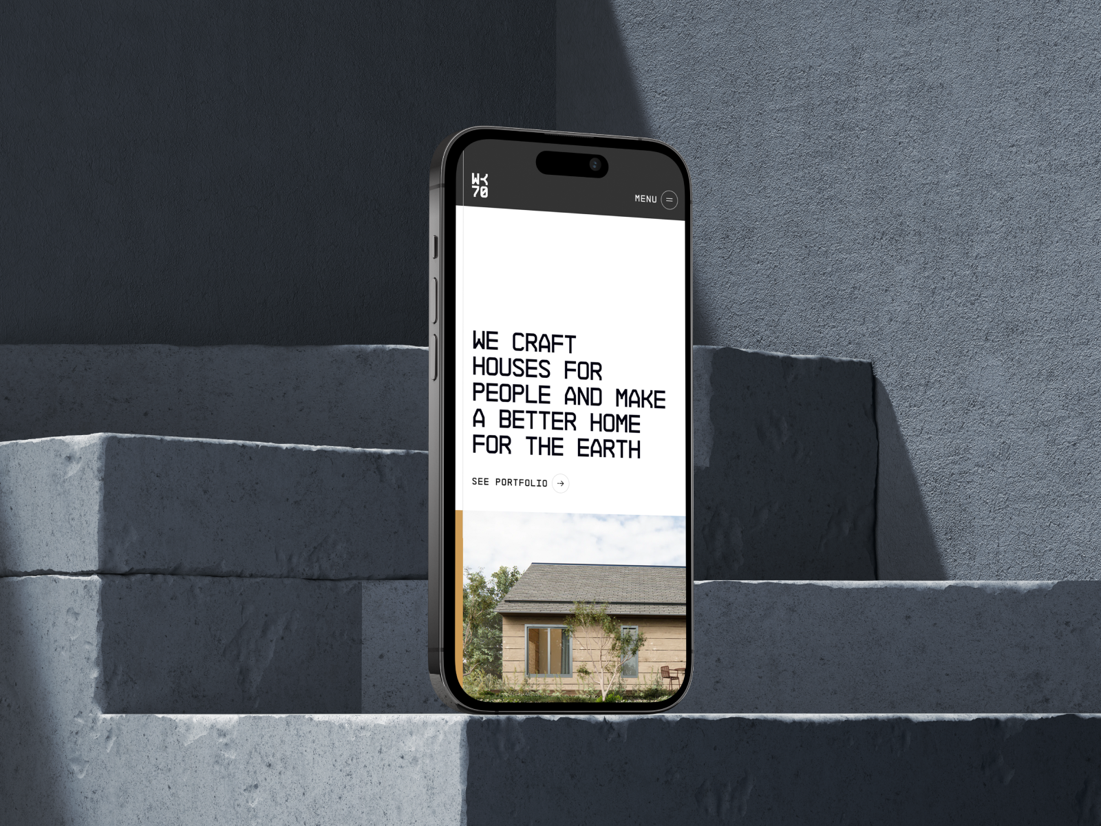
Crafting a bold identity for a sustainable vision. For Workshop 70, a real estate brand committed to sustainable development, we designed a brand identity that communicates strength, clarity, and long-term purpose.
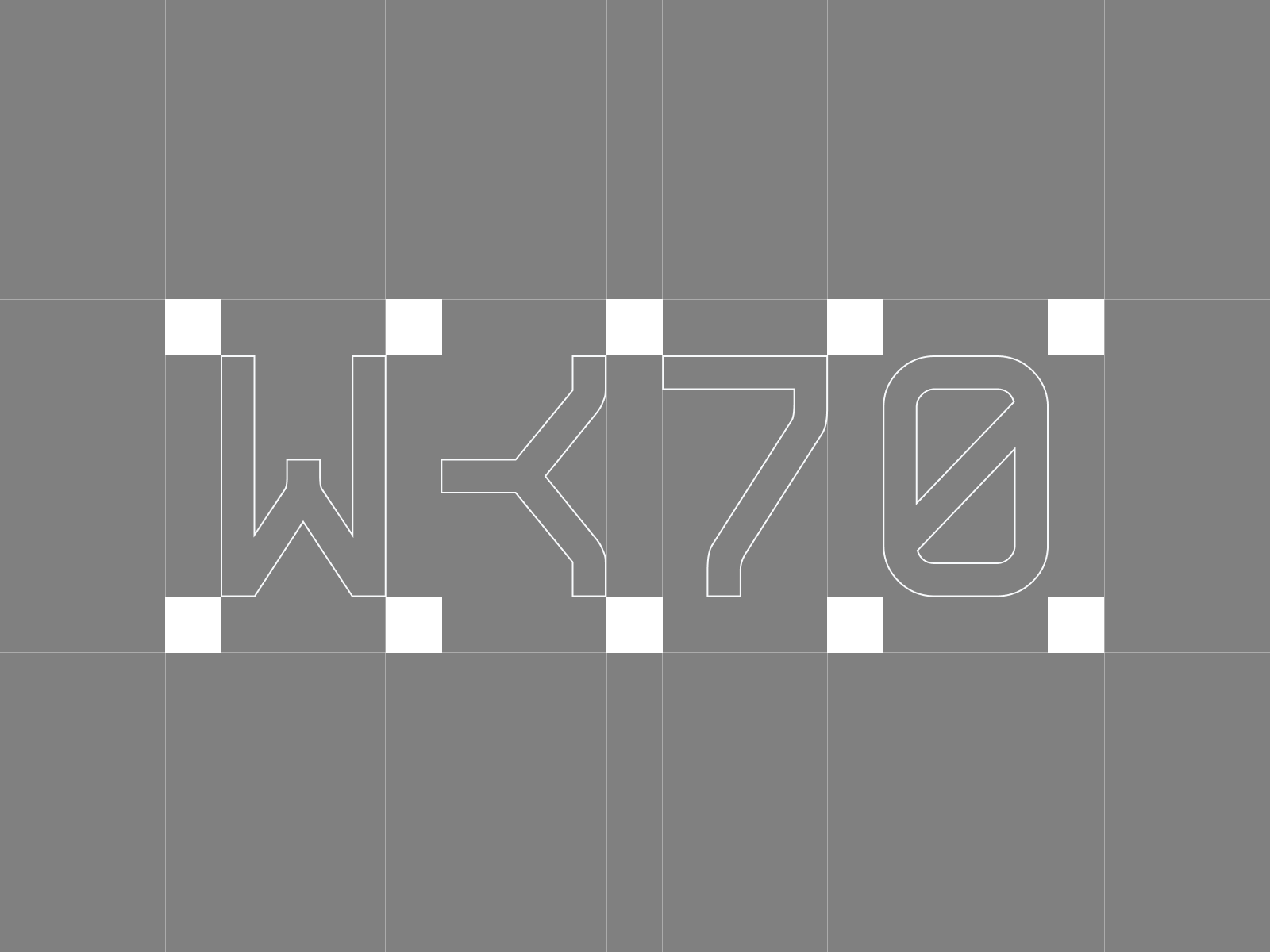
At its core is a distinctive “K” symbol, cleverly formed by merging the end stroke of a “W” creating a powerful visual anchor that reinforces brand recognition and visual consistency. The mark balances structure and creativity, capturing the brand’s ambition and direction.
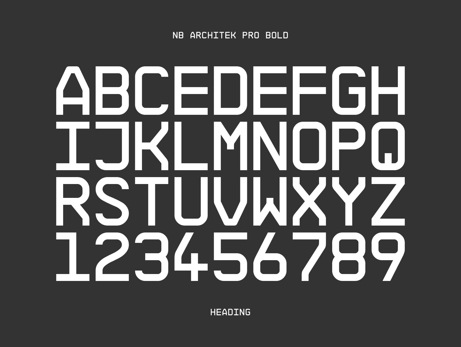
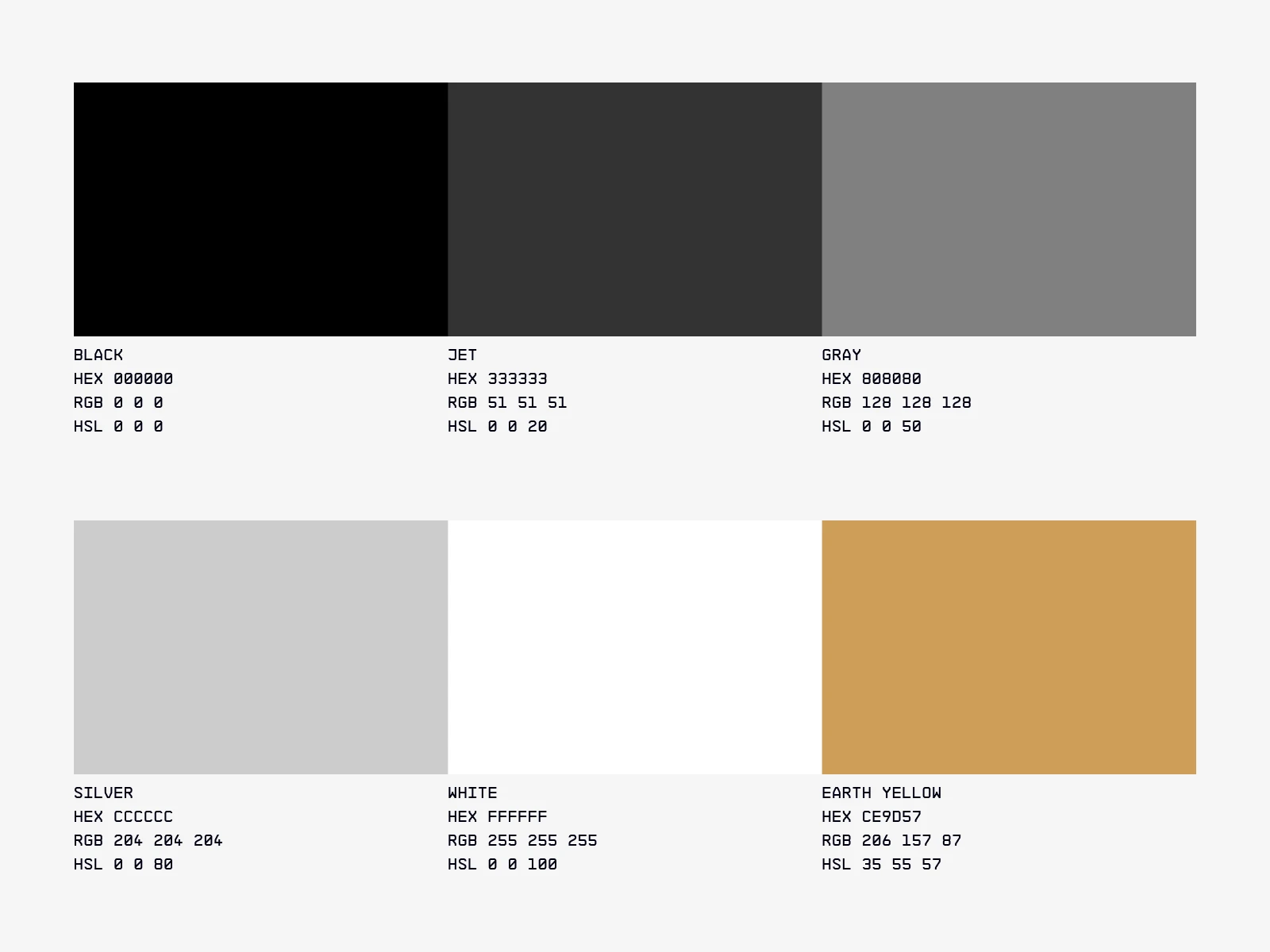
The typography was carefully chosen for balance and readability, creating harmony across all applications. To express the brand’s commitment to sustainability, we introduced an earthy yellow accent, adding warmth, vibrancy, and flexibility across digital and physical touchpoints.
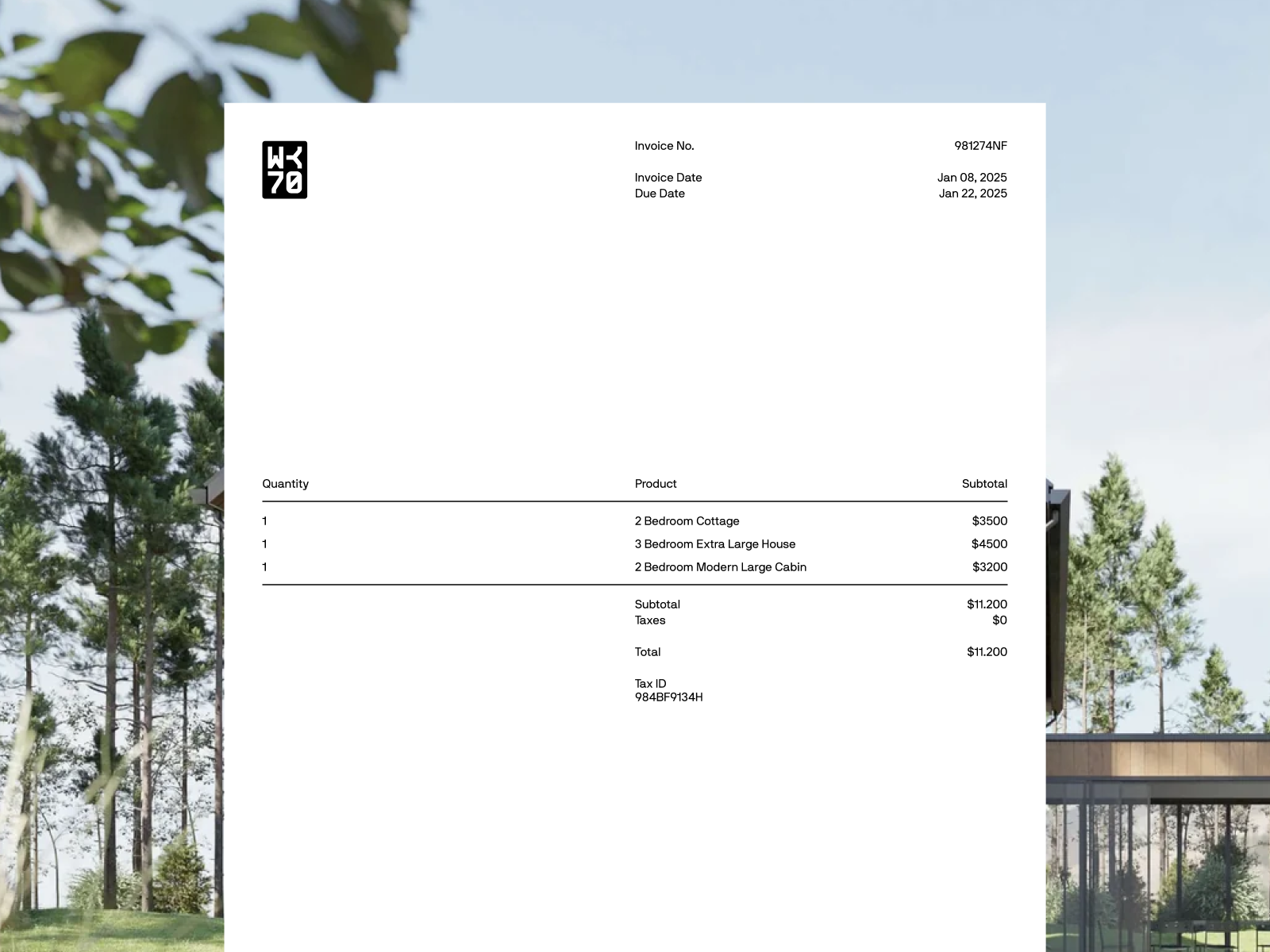
The foundation is supported by a classic black and white palette; timeless and versatile, suited to scale across applications. To enhance flexibility, we also developed a stamp-style logo variation that echoes traditional real estate seals. This version brings an added tactile quality, perfect for use on packaging, signage, and certificates where trust and authenticity matter most.
The result is a modern, intentional identity system that adapts across mediums; built to grow with Workshop 70’s vision of sustainable real estate.
Industry
Real Estate
Services
Brand Identity
Year
2025
Credits